
CASE STUDY • 2020 • ONGOING
India Sweet House
A premium mithai brand born at our kitchen table during lockdown — and shaped, four years on, by a single strategic refusal: to look like every other Indian sweet shop.

Client
India Sweet House (ISH),
Bengaluru
Founders
Shwetha Rajashekhar &
V. Vishwanath
Year
2020 — Ongoing
Brand custodians, year five
Industry
Premium mithai, savouries & gifting
Scope
Brand strategy · Naming · Visual identity · Packaging system · Sub-brand naming · Environmental graphics · Print & marketing collateral · Festive campaigns · Photography art direction · Brand custodianship
01 • THE ORIGIN
A brand that began at home
In the middle of the 2020 lockdown, with everywhere else shut, Shwetha and Vishwanath — friends from before — started visiting our home regularly. The conversations drifted between life under lockdown and an idea they had been turning over for a while: a premium mithai brand that took Indian sweets seriously, the way Indian food at the high end had finally started being taken seriously.
They weren't outsiders to the category. They already ran Karma Farm, a 20-acre organic dairy near Bengaluru that had been supplying milk, ghee, and khoya to other mithai brands for years. They knew, from upstream, what good ingredients did to a sweet — and what most brands in the category were doing to those ingredients on the way to the customer. The brand they wanted to build wasn't a guess. It was a corrective.
By July 2020 we had presented the founders with a strategic deck mapping the Indian and Bengaluru mithai landscape, the COVID-era consumer shifts, and three distinct positioning routes the brand could take. By the time the first store opened in 2021, we had built the brand strategy, the chosen route, the name, the identity system, the packaging family, and the early collateral. We have continued as their brand partners ever since.
02 • THE BRIEF
Two traps the category sets
The founders had clarity on the business: hygiene-first, ingredient-honest mithai, milk and ghee from their own dairy, presented at a premium that the existing market wasn't meaningfully catering to. What they needed was a brand world that could carry that proposition without falling into the two traps the category sets.
The first trap is defaulting to Mughal. Most "premium Indian" branding leans North — arches, jaali, paisley, gold-leafed everything. It works, in that it reads as Indian heritage instantly, but it also reads as every other premium Indian brand instantly.
The second trap is over-modernising. The flip side — minimalist sans-serif, beige, stripped-down packaging — solves the differentiation problem but loses the emotional weight that mithai actually carries. Sweets are gifted at weddings, sent to neighbours during Diwali, placed first in a child's mouth on their birthday. A brand that strips that out wins on Instagram and loses on Dussehra.
03 • STRATEGIC EXPLORATION
Three routes
The strategy deck we presented in July 2020 — developed with The Strategista, our strategy and naming partner on this phase — mapped the existing Bengaluru mithai landscape and offered three distinct positioning routes. Each came with its own positioning story, mood, naming family, and packaging direction.
Mindfully
Made
ROUTE I
Rooted in India
Rustic · Refined · Farm-anchored
The farm-anchored play. Karma Farm forward, rustic-craft aesthetic, classic Indian sweets made like they used to be.
NAMES PROPOSED
Karma · Rasm · Mishtata · Ksira · Gavya
Finesse
•
Devine
ROUTE II
Pure & Luxurious
Minimal · White-and-gold · Urban-luxe
The high-art-of-milk-sweets play. Khoya / Bombay Sweet Shop territory. A premium milk-sweets boutique.
NAMES PROPOSED
Mou · Gur · Moorland · Shuddhi · Madhurasa · Rasottma
CHOSEN
Truly "mast" Indian Flavour
ROUTE III
Local, Indian, Eclectic
Regional · Place-anchored · Tradition meets modern
The regional-celebration play. Tradition-meets-modernity, vibrant, place-anchored. A celebration of Indian mithai with Karnataka local roots.
NAMES PROPOSED
Karma · Rasm · Mishtata · Ksira · Gavya
The founders chose Route III. It was the boldest of the three — the other two had clearer category precedents to lean on, and Route III asked the brand to invent its own visual lane. But it was also the only one that did justice to what they were actually building: not just a luxury milk-sweet boutique, not just a farm extension, but a working premium mithai brand for a city, and eventually a country, that hadn't quite seen one like this before.
"India Sweet House" is,
by design, the least poetic name in the premium mithai category. That is what makes it work.
04 • THE NAME
From Bangalore Sweet Shop to India Sweet House
Route III's name candidates clustered around place and product: Bangalore Sweet Shop, Bangalore Mithai Shop, Bengaluru Local. The thinking behind that family was simple — declare the city, declare the category, refuse to hide behind a poetic neologism. It was a name strategy that trusted the work to do the lifting.
As the conversation moved from route to brand, two things shifted. The first was scale: the founders weren't building a single Bangalore store, they were building a brand that intended to outgrow the city. The second was register: Bangalore Sweet Shop was honest, but it leaned more neighbourhood-favourite than premium-mithai-brand. We needed the directness of the family without the smallness of it.
India Sweet House kept everything that made the Route III names work — the geography, the category, the refusal to be precious — and scaled it up. The wordmark itself plays into this directness: each letter sits in its own tile in the 9-tile Athangudi frame, like a shop sign declaring itself, no flourish, no apology.
05 • VISUAL LANGUAGE
Looking South
If Route III was what the brand was, the visual language was how it would say it. The most consequential decision in the entire project was to anchor that language in Dravidian aesthetics — specifically Athangudi tiles and Kolam — rather than the default Indo-Mughal vocabulary the category runs on.
The decision wasn't a left-turn from the strategy. Route III had already pointed south — the naming candidates included Kannada words, the positioning talked about regional favourites. What we did at the visual stage was take that direction and make it specific. Not just "South Indian in feeling," but South Indian in lineage you could name.

SOURCE
Athangudi Tiles
Handmade cement tiles from old homes across Tamil Nadu and parts of Karnataka.

SOURCE
Kolam
Dot-and-line floor patterns drawn at the threshold of South Indian homes each morning.

OUTCOME
The ISH mark
A 9-tile Athangudi frame holding the wordmark, with a dotted Kolam border above and below.
The founders were aligned on the direction from the start, but holding the line on it has been the longer story. Brand language is invisible until it isn't. Many times over the years, an enthusiastic suggestion would land — can we add a tree on this box, can we put a peacock on the Diwali pack, this floral motif looks so nice on Pinterest, can we use it just this once — and our role has been to gently say: that belongs to a different brand. The Dravidian visual logic only works if it's the only logic.
It's not glamorous work. It's also the work that keeps the brand premium at 50+ outlets.
06 • THE SYSTEM
A kit of parts built to scale
Typography
NT Fabulous, a high-contrast display serif, for headlines and ceremonial moments. Avenir for body. The display face does the heritage work; the body face does the legibility work.
India Sweet House
Each sweet a journey through the diverse flavours of India. We offer over 200 meticulously prepared delicacies, from beloved classics like pedas and burfis to regional specialities.
DISPLAY
NT Fabulous
BODY
Avenir
Colour
Four primaries — the deep ISH red, a warm cream, a dark brown, white. Plus a secondary palette of twelve heritage-leaning accents that rotate across festive campaigns and product sub-brands.
PRIMARY
04
SECONDARY
12
Pattern Library
Filled patterns for packaging and high-impact print, stroke patterns for digital, a set of geometric motifs, and a system of borders. A kit of parts that recombines across any new touchpoint without the brand losing coherence.


FILLED • STROKE • MOTIFS • BORDER
The Mark
A 9-tile Athangudi frame holding the wordmark, with a dotted Kollam border above and below. The grid structure scales cleanly, holds up at 2.5cm minimum, works equally well as a square seal on a box top or a horizontal lockup on a billboard.

9-TILE FRAME • 5 x 3 WORDMARK GRID
07 • SUB-BRAND NAMING
The gemstone gifting system
Two years into the brand, ISH commissioned us to design their first major festive gifting brochure. The product range had grown into a structured set of tiered hampers, and it needed a naming system that could carry the line without resorting to Premium Box, Deluxe Hamper, Signature Selection. We proposed naming each tier after a navaratna — the nine sacred gemstones of Indian tradition.
I
Gomedh

Dry fruit hampers
II
Panna

Indian namkeens
III
Praval

Luxurious assortments
IV
Vajra

Ghee & dry sweets
V
Moti

Premium mixed sweets
VI
Manikya

Assorted ghee sweets
VII
Vaidurya

Dry-fruit sweets curations
VIII
Kanaka

Popular sweets & savories
IX
Neelam

Signature sweets in tin
The system gives the gifting line a vocabulary. It carries cultural fluency — gemstones, in Indian tradition, are tied to auspiciousness, gifting, and ceremony. And it gives every box a tiny piece of story: when you receive Vajra, you've been given the diamond. One naming decision unlocked a year of design work — colour, pattern, packaging, the brochure itself.
08 • THE WORK IN THE WORLD
A working brand at operational scale
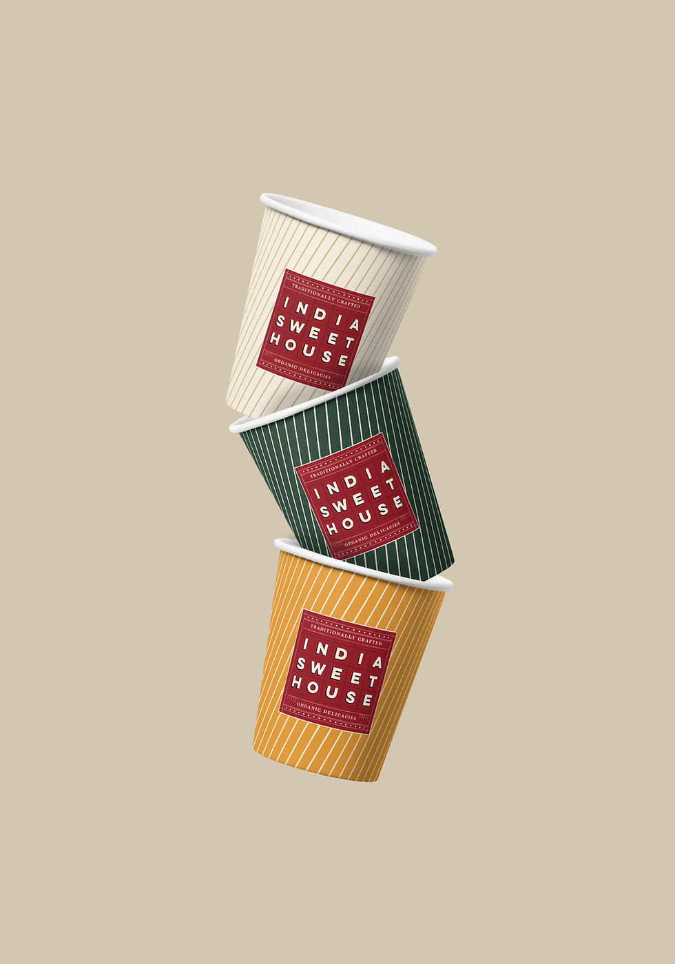
Beyond the core identity, what we have actually built over four years is a working brand at full operational scale — packaging, festive campaigns, in-store environment, print, photography art direction.




09 • CUSTODIANSHIP
The work that doesn't show up in a portfolio image
Year five looks like this: new outlet opens, signage system gets adapted to a new shopfront constraint. Founders return from a trade show with three new product ideas, packaging gets developed for each. Festive cycle begins, a new campaign concept gets briefed, shot, designed, printed, distributed across 50 stores in three weeks. A vendor mocks up a hoarding with the logo at the wrong proportion, we catch it and send the corrected file. Someone proposes a tree.
This is the part of the work that compounds. A brand at 5 outlets can survive design drift; a brand at 50 outlets cannot. What we build week to week is consistency — the kind that makes the brand feel like the same brand whether you encounter it at the Malleshwaram store, on a Diwali billboard, in a magazine ad, or as a tin handed to you at someone else's wedding.
10 • OUTCOME
From kitchen table to fifty stores
Featured in Global Indian, Restaurant India, ET, and other national publications. The first international expansion (United States) launched and is currently paused on import-restriction logistics. In a category where most premium players still default to Mughal-inflected visual codes, ISH has carved out a distinct territory and made it their own — a territory that, four years in, no competitor has tried to copy. That, we think, is the real measure of whether a brand language is working.
50+
Outlets across Karnataka
4 years
As brand custodians, ongoing
#1
Bangalore's Fastest Growing Premium South Indian Sweet Brand · ET Business
Credits
Studio
Parul Kanodia & Co
Strategy & Naming
Parul Kanodia & Co with
The Strategista
Identity, Packaging, Print, Art Direction
Parul Kanodia & Co
Founders / Client
Shwetha Rajashekar,
V. Vishwanath
Photography
Soham Shoney
Food Styling
Bonani Hazarika
Year
2020 - Ongoing